
I have just enrolled in a Data Science course on Udemy and I learned good stuff.
In the previous article we learned how to work with aliases. We will learn how to add a reference line in our bar chart.
Before I start, I’ll show you a trick in Tableau.
In our bar chart we can see the labels in this order : percentage and below : « Stayed » or « Exited ».
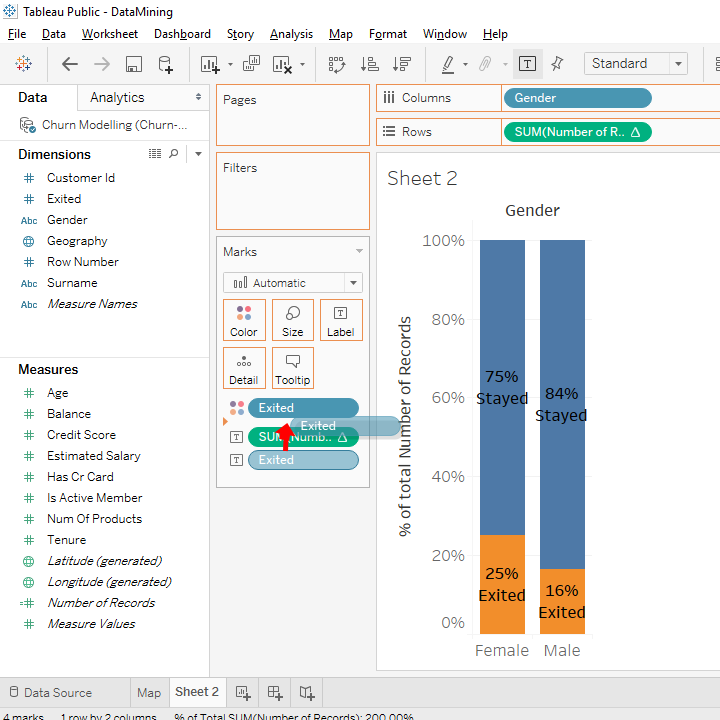
We will reverse this order. You go in this rectangle.
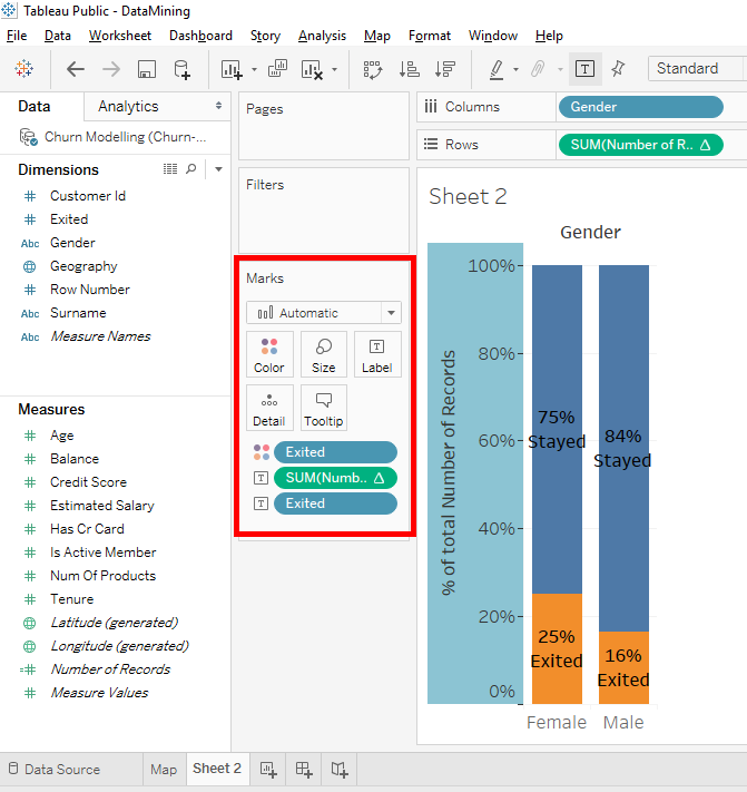
And you place the label « Exited » above the label « SUM(Number of Records ».
Look, the label « Stayed » is above percentage.

With that, we can understand the bar chart more easily.
Let’s add a reference line, let’s go . But before, I think you’d like to know why I’m talking to you about a reference line.
A reference line helps us to compare bar chart results with a benchmark. This benchmark is represented by this reference line.
In our case, the benchmark is the percentage of clients who left the bank in our sample of 10 000 people.
The first thing to do is find this percentage in our bar chart. To be able to do that, remove « Gender » from « Columns ».
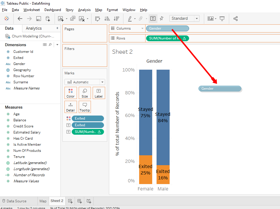
Boom, we have a new bar chart.
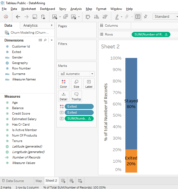
Look, we only have the percentage of clients who left the bank and the percentage of clients who stayed in the bank.
We see that on our sample of 10 000 people, there are 20% of the clients who left the bank and 80% of the clients stayed in the bank. This means that the churn rate (client departure rate) is 20%.
What we’re going to do is we will add this churn rate in our A/B test. To return to our A/B test, press 2 times on Ctrl+Z or Command+Z or you can click 2 times on the « Back » button in the menu bar.
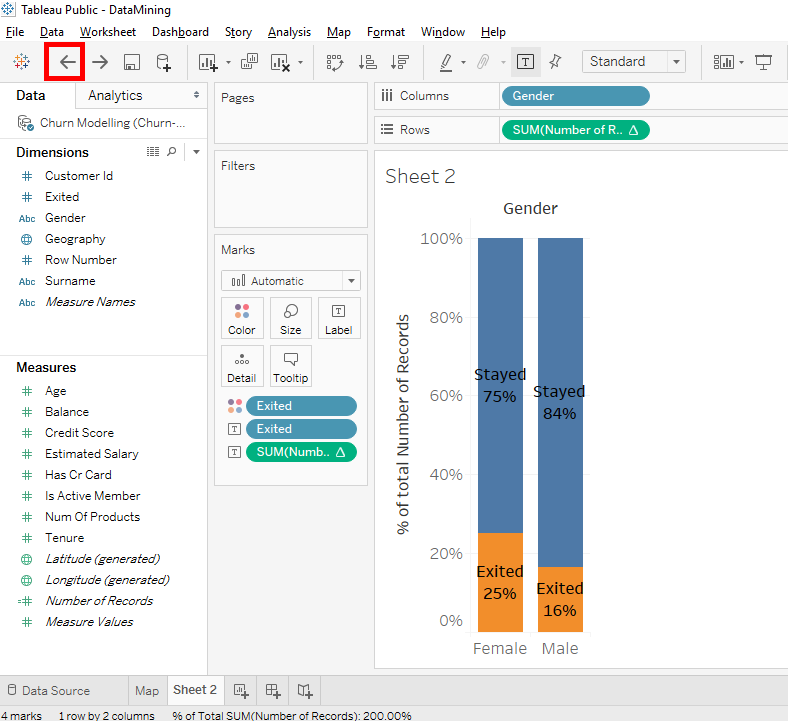
Now we know that the average clients who left the bank is 20%.
We will add a horizontal line in the Y axis (Y = 20%) to compare the 20% of the churn rate and the 2 categories male and female.
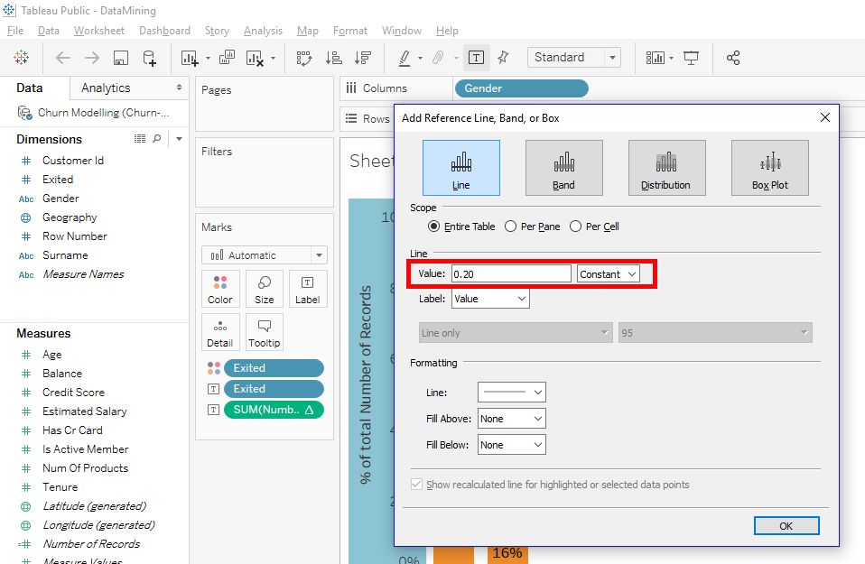
Let’s go. Right-click on the vertical axis (Y axis) and select « Add Reference Line ».

A window appears with several options.
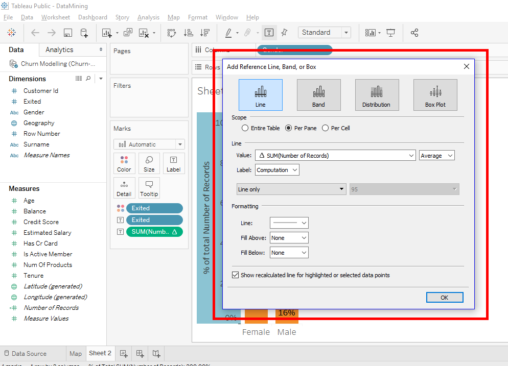
You have the choice to add a line, a band, a distribution or a box plot.
We will use the line for the entire table.
Click on the « Line » button and activate the « Entire Table » checkbox. In « Value » selects « Constant ».
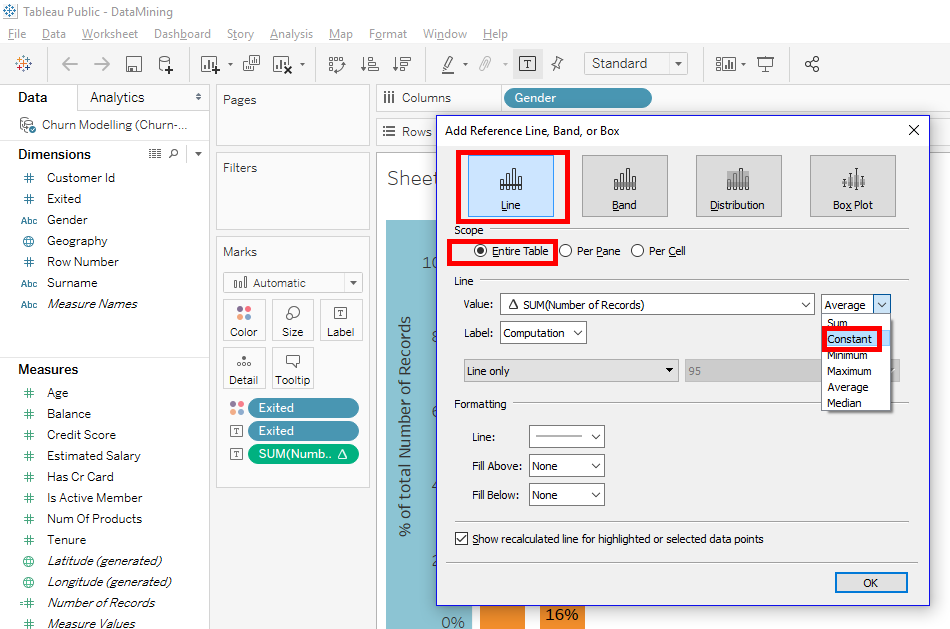
The constant is 20%, so it’s necessary that you put 0.20 in « Value ».
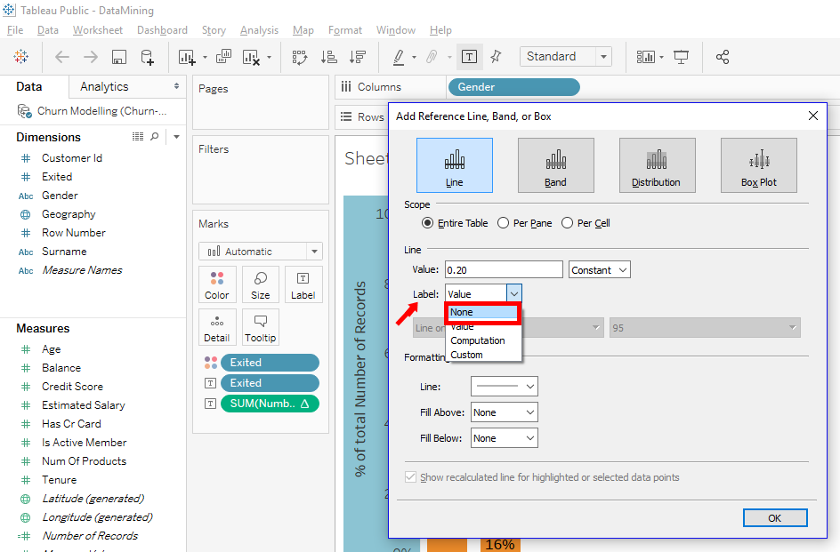
It’s possible to put a label on this reference line. For example, if the line reference corresponds to a formula, the label displays the formula. But for our case, our constant is 20% and it’s already displayed on the vertical axis so we will select « None ».
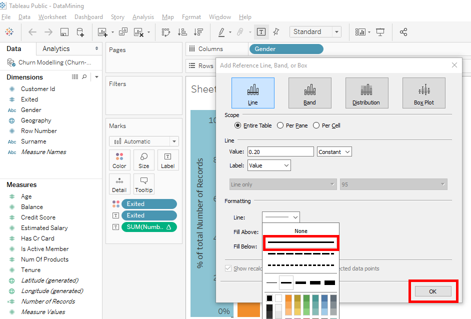
For the format of the line, select the continuous line and click on the « OK » button.
We have our reference line is added to our chart.
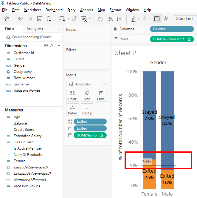
Here is what we can see. Female clients are more likely to leave the bank than average clients. Male clients are less likely to leave the bank than average clients.
In our case, it’s obvious to see that because there is only 2 categories, men and women.
Now you know how to add a reference line in a bar chart.
Share this article if you think it can help someone you know. Thank you.
-Steph