I have just enrolled in a Data Science course on Udemy and I learned good stuff.
In the last article, I showed you how to do a simple A/B test. We will continue with the result we had with the A/B test.
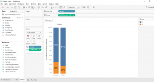
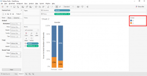
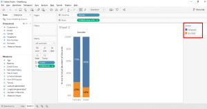
Here is the result of the A/B test. What is in orange is the percentage of men who left the bank, it’s 16%. What is in blue is the percentage of women who left the bank, it’s 25%.
With our bar chart we can quickly see that women are more likely to leave the bank than men, all the rest being equal in our sample.
I remind you that this is a basic A/B test. There are 2 type of A/B test, the basic A/B test and the statistical A/B test. The statistical A/B test is done with a statistical test like the KHI-2 test. For our case, the basic A/B test already give us good insights.
To make our bar chart even easier to read, we will work with aliases.
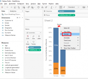
The first thing we will do is we will improve the format. Right-click on this space between « Gender » and the bars and select « Format… ».
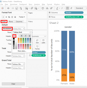
The « Sheet » tab appears. In « Worksheet » changes the text size to « 12 ».
What is good with data mining is that we aren’t obligated to make a perfect chart because we don’t have to present them in a report to managers or a meeting.
For example, if I had to present this chart in a report, it would be necessary to change the vertical title. But we only make a model so this change isn’t necessary.
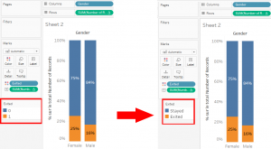
Now, look at this rectangle. We can see « Exited », « 0 » and « 1 ».
« 0 » means that the client stayed in the bank and « 1 » means that the client left the bank. We can also see that client who left the bank are in orange so 25% for women and 16% for men. And the client who stayed in the bank are blue so 75% for women and 84% for men.
We did an excellent basic A/B test but it would be much easier to read if we replace « 0 » with « Stayed » and « 1 » with « Exited ».
With aliases we can do that. An alias is to replace the binary results « 0 » and « 1 » with « Stayed » and « Exited » because it’s not easy to remember the meaning of « 0 » and « 1 ».
There are 2 ways to do it : create a calculated field or use aliases.
We will use aliases. Know that aliases are not going to change the « 0 » and « 1 » in the dataset, this change is only in Tableau.
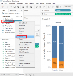
In « Dimensions », right-click on « Exited » and select « Aliases… ».
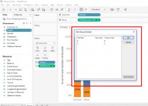
A small window appears. In this small window, you can create an alias for each value contained in the « Exited » variable.
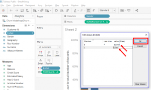
The variable « Exited » contains the value « 0 » and « 1 ». For the value « 0 », we will create the alias « Stayed » to say that the client stayed in the bank. For the value « 1 », we will create the alias « Exited » to say that the client left the bank. Then click on the « OK » button.
Look, we can see the new values in the rectangle.
The values « 0 » and « 1 » have been replaced by « Stayed » and « Exited ».
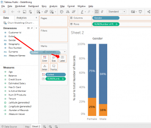
Now that the aliases saved, we will take the variable « Exited » in « Dimensions » and move it to « Label ».
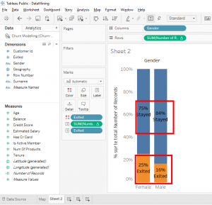
Look, we have our aliases « Stayed » and « Exited » on the bar chart.
In this ways, it’s easier for people to read the bar chart without asking what meaning of « 0 » of « 1 » values. « Stayed » and « Exited » are clearer.
Now you know how to use aliases so that people can easily read the binary values of a chart.
Share this article if you think it can help someone you know. Thank you.
-Steph
